This one I think will go with compare and contrast. The reason is for the shapes and shades this piece of work shows. How one side is darker than the either-or how this shadow is longer than the other. I learned how to do the 3d shapes from many different videos. I did not really have an inspiration for this piece of work. I think that this is a good piece of work. I like how it came and how it looks. It has a filter on it right now, to show a different side to this piece more darker.

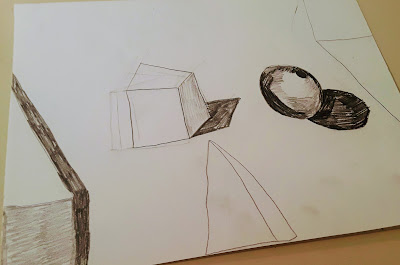
I really like your drawing, but there are things you could have added to make it better. For example, you could have drew a light to show the angle the light was coming from, it would have made it easier for an eye to pick up the angle. Another thing you could have done is second drawing, where which the lighting is from a different angle. If you could have done two different pieces, I think it would have been easier to compare and contrast the shodows.
ReplyDelete