What I have done so far is, added more color pencil to the piece. What I'm going to do next is, add some type of paint to it to give it a different texture to it.
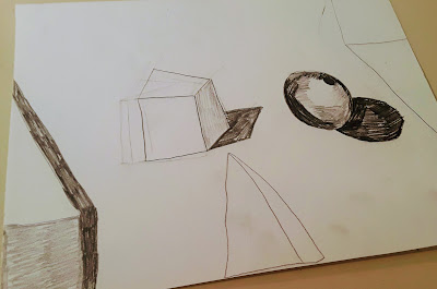
This one I think will go with compare and contrast. The reason is for the shapes and shades this piece of work shows. How one side is darker than the either-or how this shadow is longer than the other. I learned how to do the 3d shapes from many different videos. I did not really have an inspiration for this piece of work. I think that this is a good piece of work. I like how it came and how it looks. It has a filter on it right now, to show a different side to this piece more darker.
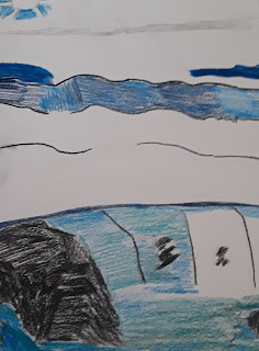
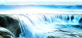
I have started my 4th project. What I'm drawing for this one is a waterfall with mountains in the background. I think it will try out pretty good. And to the left, you can see what the image look's like. And I have made good progress on this so far. By the time I finish this, I hope it's better looking. The three images you see are part of my first draft. More will come over time as I work on this.
I got ideas from videos I watched on youtube. It helped me out learn by how to draw the shapes again since I forgot how to draw shapes. This is for my third project. I'm thinking compare and contrast. Because of the shades and the values of the shapes and how the sizes are different and how the shapes are different.


Comments
Post a Comment